[ Notes | Pages: 1 | 2 | 3 | 4 | 5 | 6 | 7 ]
|
Ellen Patterson, Editor Lynn Askew, Author Jim Munson, Activities Jeremy Fowler-Lindemulder, Artist |
[ Notes | Pages: 1 | 2 | 3 | 4 | 5 | 6 | 7 ]
|
Ellen Patterson, Editor Lynn Askew, Author Jim Munson, Activities Jeremy Fowler-Lindemulder, Artist |
I had recently returned from a trip to Israel in mid March where we were usually aware of the presence of military force. Guns were present in many public places, and stone walls separated the open spaces into safer havens for those within. On one occasion we even observed a group of school aged children on a field trip accompanied by armed guards. Questioning our tour guide, he informed us that it was the law that all children on school trips be protected in this manner. We were saddened to hear this, and we were glad that our own country was not this sort of place.
On April 19, I was in my classroom as normal. When second period began, students started coming in asking questions like "what happened?" Having been inside at the time, I had no idea that anything had happened at all, but some students had been outside at band practice, or in or near the then new school library. Those outside had heard and felt something disturbing and wanted to know what it was. McLoud Oklahoma is about 30-40 miles from where the Oklahoma City bombing took place.
Over the next several hours and weeks, the horror, the realization, and finally the unity of what has grown out of the Oklahoma City bombing unfolded around us. On that first day, we turned on the classroom televisions provided by Channel 1, and watched the media scramble for some comprehension of what had happened. The first reports were confused and conflicted as we continued to gape in disbelief. For me, it was the imagined horror never experienced on my peaceful trip to Israel coming very close to home.
A couple of months later I received a call from the Oklahoma City branch of Lutheran Social Services of Kansas and Oklahoma (LSS). My name had come up as a local Oklahoma artist, who also happened to be Lutheran, who might illustrate an upcoming childrens' booklet based on the bombing. The next day I sought out their office, and was given basic notes on the story focusing on scenes to illustrate. I remember being shown a rough draft of the story as well, but being unable to effectively read the handwriting.
With my own hastily scrawled notes in hand, and the time constraint of an upcoming trip weighing on my mind, I stopped off on my way home to obtain a pad of 11" x 14" two ply bristol board and a couple of permanent felt tip pens. I began work on these images that night, and basically drew straight through in chronological order to their completion a few days later. I did sleep and eat, but I put a great deal of other things on hold for that time.
For each of these images, I have made some retrospective notes, which may be accessed by clicking on the "Notes" links or main pictures in the story pages. The artwork here is my main concern, the story text is included primarily for contextual reasons. Many other pages of activities were included in the original publication which are not included here since they have little actual relevance to the illustrations. For a complete copy of this booklet, please contact:
Lutheran Social Services of Kansas and
Oklahoma
1855 N. Hillside
Wichita, Kansas
(316) 686-6645
The following sections are specific artists notes for each of the pictures drawn for the publication:
 Page
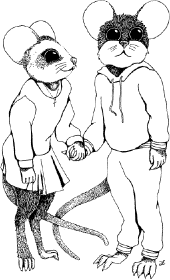
1: Cover Picture of Mury and Meri
Page
1: Cover Picture of Mury and Meri
When I was originally being briefed on this project, there were two color pictures requested. This one was supposed to be the cover, but since they never mixed the type and pictures it was moved to the second sheet inside as a stand alone. One of my original dilemmas was basic visual characterization, after all this was to be a story about mice. Would they be particularly rodent like, or anthropomorphic, or some sort of mixture of the two. This was to be a children's book. How would children relate to a bunch of little identical cheese nibblers? Barring differences in fur coloration, mice tend to look alike; at least they do to us humans.
I soon learned that they had no idea in mind of what look they wanted, and it was up to me to produce images that were mouse like, but not too mousy. They needed to be human, but not too human. Most of all they needed to strike a chord in the story creators that would allow them to nod their heads and agree that the character images that they could not put into words were these very ones.
There is no mistaking these imaginary creatures for anything other than rodents. Still, I based their proportions on classical human forms, adding the mousy body structure over a human one. Clothing made a lot of difference as well, by concealing the primary mousiness of their bodies and furnishing a recognizable human element. I remember looking through a J. C. Penney catalog for some basic clothing styles. By varying the shape of the head and ears and individual coloration, each mouse is discernible from the others by facial recognition alone. Clothing, size, and faces made these potential rats recognizable through human means.
This picture was originally drawn on a full 11" x 14" board, and then reduced to an 8.5" x 11" sheet and painted with acrylics. Thus there were two originals of this image, one black and white, and one color.
The style of illustration was very important to me. I did some quick research into a past LSS book project, and found that concise reproduction was not necessarily the top priority. I wanted to create highly detailed images that would reproduce easily, making it difficult to do a poor reproduction job.
I had originally produced these images for 50% or more reduction in size, taking up only half of the 8.5" x 11" page format. The pictures were intended to share the page space with the story text. Interestingly enough, little or no reduction was actually performed in production, leaving some of the pictures clipped. I left the original pictures with LSS, but I did keep black and white copies of them and the color pictures were reproduced in the proper size and format. I have made no effort here to show their intended size, but I have tried to show them in their entirety and in context.
This image was supposed to do two main tasks. Foremost, it was meant to introduce the two main story characters, Mury and Meri. As a side note, Furry was not to be shown. Evidently, although the character is actually pivotal to the theme of the story, it was felt that showing the character might upset some younger children.
Secondly, it established the visual language for the whole story. The images are foremost simple contour line drawings. Remove the shading and, and the image still makes sense. Hatching and stippling were added afterward to add a greater feeling of overlapping shapes, and the black background makes an easily reproducible area that conveys a feeling of great interior space.
The key to this image is "brokenness." The story starts out pleasantly enough, but then the idea of sin is introduced. The story glosses over the subject by using vagueness. My theme here was the original fall from grace and the broken covenant, symbolized here by bent and broken boards and cracked pipes. Vaguely enough, no one is at fault here, it is the separation caused by sin that gets the bad rap.
Also of note are the eyes. For some time afterward I got comments on the eyes in all of these pictures as being so expressive. This picture has the only set of expressive eyes in the entire project, and they are closed. Look at all of the other pictures, and hold your hand over the rest of the face. All of the mouse eyes are practically identical and expressionless. They are all round with white highlights, and do not change. Any expression in the faces of the characters in these drawings is carried through the mouths, body language and the imagination of the viewer.
So, what do I say to people who complement the expressive quality of the eyes? I say, "Thank You."
This picture is a study in composition. I have even used it on occasion to show the basics of the "golden mean." The still picture contains a swirling element radiating from right to the left from the light ray up through the intertwined arms and hands into Mury's face. Dividing the image into thirds will reveal more compositional continuity as well.
Notice the shape of the mouths and eyes. Changing the mouths and whiskers on these figures could entirely change the mood of the picture. This image was designed to be the mental opposite of picture number 3. Rather than focusing on "brokenness," everything in this picture is unified. Even the beams and pipes are whole and they cross in a knot that frames the protagonists. This all takes place in the left half of the image in order to counterbalance the beam of light that descends from the right representing "hope."
I have received several comments from people that think I over analyze everything. They think that there is some sort of spontaneous quality that I stifle when I give specific formulas and precise descriptive terms to an image. Here is where I disagree. They have bought into the myth of "talent."
Now, I am not saying that there is no such thing as talent. Rather, I think our common definition of the word is misplaced. We think of talent as being some sort of natural disposition with which children are born. Somehow we expect that at a certain age artists just begin spontaneously calling forth this hidden ability and create masterworks. Well, don't hold your breath. Talent is what we tend to call the end result of years of continuous effort and thought processes. The fact that many of these processes are invisible to the viewer who does not share the hours upon hours of practice preceding a specific picture, sculpture, or event just compounds the illusion of spontaneity. Furthermore, artists tend to mentally internalize their practices and studies, often reinventing them and again internalizing them without the benefit of common vocabulary. It is their often common inability to verbalize their experiences using an accepted set of descriptive words that continues to perpetuate the illusion of spontaneous creation, even in the artists own minds.
Personally, I have internalized most of what I do, but I have also reverse engineered most of the processes to a point where I can describe them to someone who takes the time to learn the same vocabulary.
Page 5: Mury and Meri hug Mom and Dad
This picture was originally supposed to run vertically as a half page, but since the printer did not reduce it to its intended size, it was clipped in production. This is the first forum where it has been presented in full.
Enter two new characters, Mom and Dad. I had not given much thought to what they would look like prior to beginning this picture. Again, the basic clothing archetypes were gleaned from a J. C. Penney catalog. Making them into a cohesive family unit took a little more thought.
The figures are connected compositionally by overlapping ranks, they are intertwined with arms, hands, and through their glances. I finally ended up basing the parent's faces on the faces of the children.
 Page
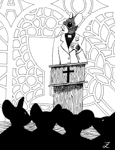
6: Pastor Mouse and Funeral
Page
6: Pastor Mouse and Funeral
This image was the second color picture in the book. My original basically read that there should be a funeral in front of a stained glass window. Since no specific window decoration was specified, I got to create it. The dark shadows in the foreground are just generic mousy shapes, and add slightly to the feeling of depth. On the whole, this picture turned out very flat looking, keeping with the stained glass motif. The final colors were once again added with acrylic washes.
I did take some liberties in making some subliminal statements. As a matter of fact, this is probably the most potentially controversial image for this book, but only a very few have fathomed what that controversy might be. The stained glass designs are relatively straight forward biblical icons. The Pastor wears a wedding band and... well, I can't tell all the secrets, now can I?
Page 7: Cast Assembly with building in background
The last picture in the book is sort of a curtain call. All the previous characters are present plus two more which I assumed to represent Furry's parents. The original inspiration for this picture came from a press photo of firefighters in front of the bombed out ruins. I used the rubble in the background directly because it looked very recognizable to me. I'm not sure how much coverage was given to the bombing in other parts of the country, but local television coverage was suspended in Oklahoma for about two weeks. Basically there was no other important news for residents, and even the soaps were bumped off the air. You could tune into one of the major networks at any hour of the day or night and they would be showing pictures of the building, doing stories on the helpers, survivors, or victims, showing the bombed out building remains, or just reading support mail from all over the world. This husk was burned into our memories.
I was never sure what that shape on top of the building was. Maybe an antenna or bent pipe of some sort? In most of the photos of the building, it always struck me as a cross, and so I made sure it kept that shape in this picture.