 Basic Color Theory
Basic Color Theory
Basic Color Theory
Before we actually begin applying the various colors to a figure or painting, we should have at least a rudimentary grasp of color theory. By anticipating not only hue, but also desired effect before we begin application, much of the guesswork and mystery disappears. It is not only practice that increases painting speed, but also the knowledge of how to deal with, and decide on ways of dealing with, the unanticipated that makes painting fun rather than frustrating. For those who already know about color, this section should be a good review, with a few formalized tips for concepts specific to miniatures. For those who have been less exposed to such concepts, this is a crash course.
We begin with the primary colors, red, blue, and yellow. For those out there who are shouting , "No, it's red, blue, and green... Like my RGB monitor," you are correct also. However, the RGB triad only works with light, which is an additive process that includes greater numbers of light wavelengths. When working in pigment which reflects light, the process is subtractive, and our primary colors are different. Have no fear, the rules are derived from the same basic theory, they will just seem backwards. To derive the primary colors of pigment from the primary colors of light, just take white light and subtract one of its primaries for each. This will leave a palette of magenta (process red), cyan (process blue), and yellow (process yellow). These are the colors normally used to print color photographs in magazines. This is no surprise. Actually, it is a science. Thus, we begin with red, blue, and yellow.
Our primary colors are the most important because they can be used to make any other color on our palette. There can be found some of one or more of our primaries in every color we use. Likewise, we cannot mix other colors to make a primary color. We must begin with those colors beforehand. Always have a good bright red, blue, and yellow.
The secondary colors are those that are easily mixed from the three primary colors. Thus green is a secondary color of pigment because it is made by mixing blue and yellow. The other two secondary colors are orange and violet, which are mixed from red and yellow, and red and blue respectively. Remember, although we can mix the secondary colors from the primaries, our palette will appear cleaner and more versatile if we also have premixed versions of these secondary colors as well.
Tertiary colors can be easily mixed from a primary plus a related secondary. If we wanted red orange, otherwise called vermilion, we could mix orange and red, because orange already has some red in it. Colors that have such a commonality like red and orange are referred to as analogous. When paired next to each other they create a harmonious appearance.
Conversely, colors with no similarities whatsoever are called complementary. When complements are paired together, they create vivid and often very energetic color schemes. To help visualize where all the colors fall in relation to each other, I have included a "color wheel" diagram.
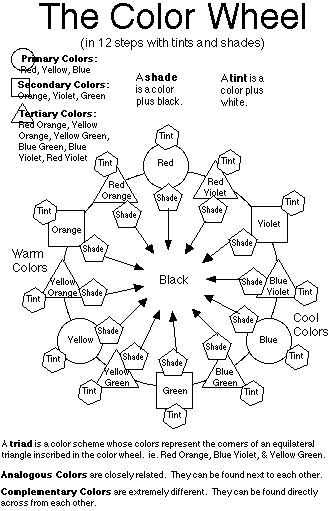
The chromatic color wheel can be as general or as detailed as one needs, as long as we keep in mind that the theory is always basically the same. We begin with the three Primary colors: red, blue, and yellow. These form our first triangle, or triad, of colors. Adding the secondary colors in the proper sequence, we have a hexagon. Note that the secondary colors are placed on the "wheel" between their contributing primary colors. Adding the tertiary colors between the proper secondary and primary colors gives us a dodecagon. Intermediate colors can also be generated in infinite variety. As a circle is composed of infinite straight lines, we can easily conceive of the wheelness of the color continuum.
Analogous and complementary colors now become relative states. Colors near one another are analogous, while colors on extreme opposite sides of the wheel are considered complements.
Note the positions of the original primaries. The sixty degree angles of their relative positions designate the concept of a color triad. For some additional colorful food for thought, all of the colors in the violet to green range are considered "cool" colors while the yellows, oranges and reds are considered "warm."
To add one final aspect to our color wheel we should briefly cover the concept of tint and shade. This is when white and black are added to a color. Think of "shade" as being in shadow, and it becomes easy to remember that to make a shade of a color simply means to add some black. How much black? That is a relative state much like the color wheel. We are getting concrete, not necessarily scientific. Likewise to tint a color means to add some white to it. Again, how much is up to you.
Selecting a Palette
The word "palette" can be confusing since it can refer to both the
object on which paint is mixed) as well as the visual range of
colors. In deference to the AD&D usage of the word "level," the
meaning of the word palette should become clear through context.
When Initially purchasing paint, one can conceivably spend a small fortune. Also, with the number of hues available, confusion often results from over specification of color names. With apologies to adamant historical purists, the name of a color is basically unimportant. Unless one has difficulty with color blindness, assembling a full palette with a minimum of colors should be relatively painless. For those with non standard cones, helpful sales people can assist in finding the proper colors.
Ignore the names, and look at the colors. When selecting a paint use your eyes. The color visible through the relatively clear bottle should be very close to the color that you can expect when the paint dries. If you have any questions about it, ask a merchant to see some of the hue.
Select your colors based on the characteristic hue of the color that you wish. If you are looking for "red" get a color that screams "RED." If it looks a little orange or purple, do not get it unless you want a lot of vermilion or burgundy. What you want are colors that will mix to form any color that you can imagine. Your palette should include:
From these colors, practically any color that you can imagine may be mixed.