The basic illusion of movement is usually illustrated through the use of specifically designed composition. There are general ways to form compositions that lead an observer's eyes around an image. Keeping the eye moving, distracting it with details, and leading it rhythmically through a picture can create an inherent feeling of movement.
For this drawing we will be using colored pencils, as well as a standard #2 pencil.
|
|
|
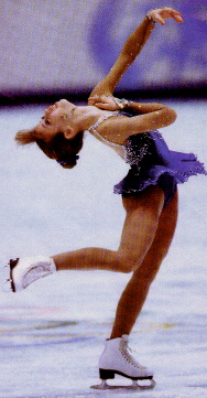
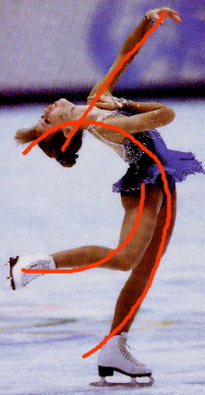
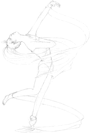
The photograph was taken from a magazine to illustrate some of the dynamics of perceived action in the human form. The lines drawn on the photo represent the main lines and curves of the body. In this case the action is indicated by a strong diagonal body line and bodily curves in a pattern much like a spring. Diagonal compositions tend to convey a feeling of action, while horizontal and vertical ones tend to look more static.
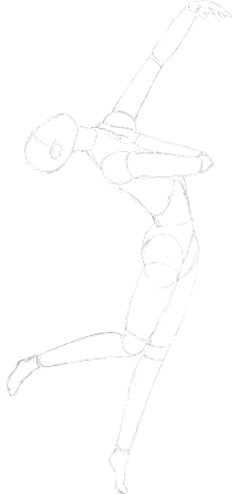
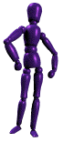 The
first step in drawing the figure is to get everything in proportion.
Human proportions tend to vary widely, but using the standard rules
of thumb the above geometric representation was created to keep the
body proportional. As drawn, this figure is about seven to eight
heads tall, creating a classical heroic model. The original skater
was about six to seven heads tall, which is more in line with correct
human proportions. The foot angles have also been changed to
eliminate the bulk of the skates.
The
first step in drawing the figure is to get everything in proportion.
Human proportions tend to vary widely, but using the standard rules
of thumb the above geometric representation was created to keep the
body proportional. As drawn, this figure is about seven to eight
heads tall, creating a classical heroic model. The original skater
was about six to seven heads tall, which is more in line with correct
human proportions. The foot angles have also been changed to
eliminate the bulk of the skates.
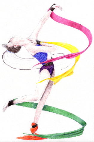
Next, the contours are detailed to create specific facial features, clothing and hair. The streamers were added to create a greater feeling of spinning movement. They and the hair twist in the wind like a corkscrew.
There are many brands of colored pencil on the market today. Some are very expensive, while others tend to be easier to afford. Basically, the pencil choice is up to the individual artist, but many of the more expensive brands are worth the price. Cheap colored pencils tend to be harder over all and often keep their point longer. This can be good for detailing, but they are not good when it comes to a smooth and burnished image. This image specifically utilizes Crayola pencils, which are middle of the road in quality for smoothness, and very good at keeping a point when one needs it.
The clothing is relatively simple to color and shade, so that has been done here already. By varying the pencil pressure, each of the streamers becomes a unique monochromatic study in itself. Analogous colors are often used in shading to give a dynamic glow. This technique works well in a bright image like this one.
The values of the skin are a little more subtle and require the inclusion of an underdrawing in darker browns. The image is lightly shaded with darker browns so that a skin tone will allow them to show through when burnished over top.
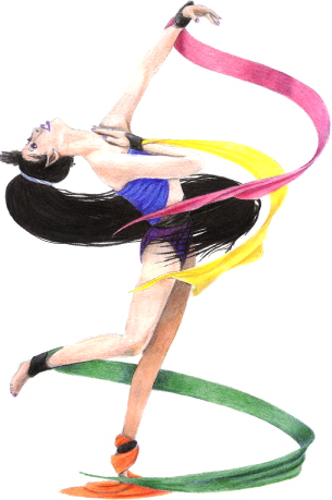
The skin color is added over the underdrawing of the shadows, and details are added. Note the hair has black, brown and purple in it in varied concentrations. The lighter colors are placed as an underdrawing in this instance, and the black creates surface line shadows over top. A white pencil helps to burnish the highlights of the skin.
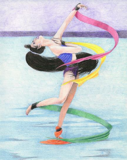
Finally, no picture seems complete without a background. Note that although the colors are general, they cooperate to show the horizon and concentrate in place to show reflection. Flat might have appeared rather dull and stifle could the feeling of movement we were trying to create.