Acrylic paint will be used for this exercise. Shown here is one of my classroom sets of standard acrylic paint. The containers hold a full range of strong colors including the primaries (red, blue, yellow), The secondaries (green, orange, violet), black, white, brown, red violet, and a light flesh base mixed from orange, blue, and white. [Palette Hues: Snow White, Mars Black, Nutmeg Brown, Dutch Blue, True Yellow, Berry Red, Wild Iris, Concord Grape, Hunter Green, Spice Orange, and Flesh.]
Also pictured are a variety of basic acrylic painting materials including a 16" x 20 " piece of canvas board. Stretched canvas is wonderful, but it can be difficult to store and transport. I used the canvas board to avoid these problems. It is not usually as nice a surface as a properly stretched canvas, but it will do nicely for this picture.
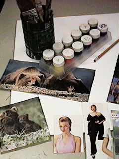
In the can are several brushes ranging in size from a 2" wide house painting brush down to a 000 fine sable taper. The standard #2 pencil is always important for generating that initial contour line drawing, and the magazine photo images are all potential reference sources. They have been gleaned from various places.
Now is when beginning artists will feel the most stress. The standard excuse is, "I can't draw people." Anyone can draw people, beginners just tend to freeze at the thought of doing it because somehow they think that drawing the human form is different than drawing anything else. We use the same techniques, and go through the same basic steps as drawing anything else in the world.
Here are some basic proportions of the human body commonly used by modern artists. Like most artistic ideals, many of these proportions have their roots in artistic observations dating back to ancient Greece.
|
|
|
|
|
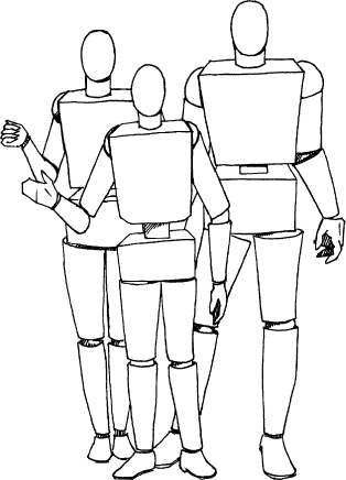
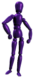
Here are three figures in "block and cube" or "wire frame" style. Notice how each basic body mass is represented by a three dimensional geometric shape. Many artist supply services sell a posable mannequin for the purpose of comparative proportions.
 Depending
on the sort of image portrayed, the basic proportions are gauged in
different manners. The common theme in proportional gauging of the
human figure is that all basic measurements are based on the figure's
oval head. The height of the body and length of the limbs is based on
the height of the head, while the width of the shoulders, neck,
torso, and hips are based on the width of the head. Note that all the
figures in this diagram have the same size head.
Depending
on the sort of image portrayed, the basic proportions are gauged in
different manners. The common theme in proportional gauging of the
human figure is that all basic measurements are based on the figure's
oval head. The height of the body and length of the limbs is based on
the height of the head, while the width of the shoulders, neck,
torso, and hips are based on the width of the head. Note that all the
figures in this diagram have the same size head.
The foreground figure represents normal proportions. The body is about seven heads tall, and the shoulders are about three heads wide. The arms and legs are close to three head heights in length, not counting the hands and feet which add another quarter to half a head in length. This is what is known as classic proportion.
The figure in the back right position is shown in heroic proportion. The body is taller, with the entire figure about eight and a half heads tall. The arms and legs are about three and a half heads long not including hands and feet again, and the shoulders are almost four heads wide. Note that the neck on these figures is almost as wide as the head.
The remaining figure in the background left shows heroic proportions for a woman. She is about eight full heads tall, and her shoulders are about three to three and a half heads wide.
Please notice that on all of these figures, about half the figure is legs. A common mistake is to make the legs too short.
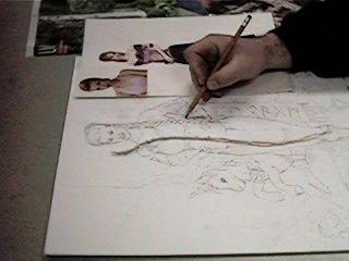
The next step is to actually create a contour line drawing from which to work. Here many different elements are combined in order to create a working image of Glorianna, sort of a friend of a friend of mine. While her basic pose has been copied from a fashion advertisement, her body proportions have been slightly adjusted to fit a heroic figure.
In this photograph I have braided some string in order to observe how the braids in her hair will look when drawn. Without this sort of prop, I might be tempted to take a shortcut and generalize her hair. This could potentially make a mess of the image. By carefully planning the contours of the image and making many decisions before painting, much of the later thought work can be simplified. If I already know where the edges will be, there will be less need for later experimentation.
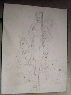
Depending on the level of detail, the contour line drawing may take quite a while to complete. It is best to invest a great deal of time and effort into the beginning stages. The contour line drawing will prove to be the most important part of many pictures. If the colors are off a little, the viewer will adjust their perception. If the values are low in contrast, creating a washed out look, the onlooker will forgive. But, a poorly executed contour will just look bad. This is where the detail and the edges of objects will be planned for the final image.
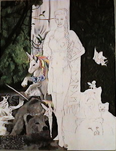
The next step is to begin painting. Using the contour lines as a guide, I first place down a base coat of flat color using a 1" brush. This base coat is obvious on the right site of the canvas board. Mixing hunter green and nutmeg brown gives me a good base coat for the wooded background. The main purpose of the base coat is to keep the white gesso layer from showing through the final painting. If I miss a spot in the background now, it will most likely show up as dark green, allowing it to recede behind the branches. The base coat for the bear, rocks, and pebbles is black mixed with brown and thinned with just a little water to make a wash. The unicorn required special attention with the base coats being carefully applied blendings of brown and white. The water was not based in, since it has pure white highlights anyway. Although often unnecessary, it is good to have base coats over large areas of similar colors, this way there is a common starting point for all the colors in a given area of the canvas. Creating unity in coloration in this manner can often help visually hold flat images together as three dimensional mental constructs.
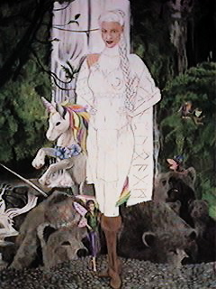
Here the background has been completed, and attention is turned to the foreground figure of Glorianna. Flesh tones are based on a medium flesh palette. Lightening is done by mixing in liberal amounts of white and feathering the colors together while they are still wet on the canvas board. Darker shading is achieved by mixing brown into the base flesh color. The leather color is a mixture of brown, orange and white with black added instead of white in the darkest areas.
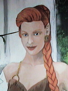
The "red" hair is primarily orange, shaded with a mixture of orange and brown, the same color as the leather. The highlights are primarily yellow that was feathered into the orange while still wet. The iris color is first painted in blue, and then repainted in a blue and white mixture, leaving the darker blue as a ring around the edge. The pupils are black spots at the center of the iris, and the white highlights make the eyes appear moist. The lips are colored with the medium flesh base mixed with both orange and red. The darker lip shading has brown mixed into it, while the moist lip highlights contain a great deal of white.

The completed image includes several accouterments. The gold effects are created through the use of yellow, and brown mixed in different proportions. Novice painters head straight for gold colored paint, not realizing that the effects of reflective surfaces are not the properties of a color, but rather are a special effect caused by careful and minute shading. The highlights in this case are yellow, and the shadows are brown.
The stole and loin cloth are based in red, and shaded with a mixture of red mixed with green. Since green is the complement of red, just a little mixed in will darken the red enough to look like a shadow. It is usually preferable to shade using complements in this manner than just by adding black. The resulting shadow colors can often be very different. The designs and critters adorning her clothing are derived from some Celtic designs in an old decorative alphabet book I had sitting around. The ochre colors were achieved by mixing differing amounts of yellow, brown and white.