 Return to the 3D menu |
|
Return to the 3D menu |
So far we have made an anaglyph by hand, and looked a little bit into why they work. Now it is time for some shortcuts with basic and advanced methods of how to put anaglyph images together.
My first time saving advice is to get a computer. If you are reading this, you probably have one, so the next advice I have is to get a good graphics program that allows for two basic functions. First, you want it to be able to grab areas of your picture and move them horizontally. Get to be good friends with area selection tools, especially your lasso. Second, you want a graphics package that allows you to manipulate RGB channels in a picture independantly. If your program has masking functions as well, then it is absolutely perfect for use in anaglyph creation. This tutorial does not cover how to use individual software packages, so consult your manual on the how to use it. The good news is you can do everything here by hand as well.
Either way, you will need a black and white original. Hand work separations are good up to a point, but every little wobble in your hand drawn line that is not echoed in the shifted image will show up as a ripple in depth and focus as well. Many 3d artists use photocopies and shift the cut-out shapes on paper. This gets a bit clutsy at times. Computers really have the advantage when doing separations, and they are great at manipulating line data.
To get a good computer image from paper to your computer you will need to scan it. Always scan black and white images in black and white mode for the best clarity. Always overscan the resolution, a minimum of 300 dpi is necessary to preserve fine detail.
Follow these steps for a good, clean line drawing scan:
For working with images at resolutions higher than 72 dpi, you may wish to view the image as it will eventually print. For this purpose, 300 dpi images should be viewed at 24%, 360 dpi at 20%, and 600 dpi at 12%. When working with anaglyph shifts for the purposes of calibrating your separation scale, you will need to convert pixels to inches.
|
Resolution |
1/16 inch |
1/8th inch |
1/4 inch |
1/2 inch |
|
72 dpi |
5 pixels |
9 |
18 |
36 |
|
300 dpi |
19 |
38 |
75 |
150 |
|
360 dpi |
23 |
45 |
90 |
180 |
|
600 dpi |
38 |
75 |
150 |
300 |
The basic separation technique in making anaglyphs is called the shift. To make any line appear farther away from the picture plane, you need to shift the blue image to the left. The farther you shift it to the left, the farther it appears away from you. We have already practiced shifts using a colored pencil. Now we will try it with a computer by editing the red (R) track of an RGB image. Here is our very simple basic black and white image, ready for manipulation.
Starting out simple allows you to practice without a lot of overlapping difficulty. Here the letters "O" and "V" have each been shifted back in the red track just a bit so that they bump the letters to their left. The letters "ERA" are shifted left even more, actually going behind the "V" in the red track.
You see the shifted black image from the red track as blue here. Remember that white pixels on a computer screen are "on" and black ones are "off". Compound this with the fact that the color mixing of light is "additive," while pigment mixing is a "subtractive," and it makes sense that the shifted red track appears blue here. The specifics of this, however, would require an entire lesson in itself. Take my word for it; if you shift black images in the red track, you see them as blue with a red afterimage in the letters from the blue and green tracks.
Try it like this: The original graphic needs a white border of at least a half an inch on either side. This allows for some shifting space. The black outlines here indicate the edge of the graphic image.
|
|
Select only the red track of the image and use your selection tools to grab the characters "POV" and ".COM". (I used a wand tool to select the background, then I inverted my selection to grab the letters - and not the background. Then I deselected the letters "ERA".) Move these to the right just a few pixels and drop them in place. Your RGB image now looks like this with the letters "ERA" on the picture plane and the rest of the image popping forward.
|
|
Next in the red track, select only the characters "P", ".C" and "M". (You can use the same method of selection or just drop the letters "O" and "V" from your original selection if your software allows that.) Move these letters a little more to the right, and drop them in place as well. Now these letters will pop forward even more than the "OV" that occupies the middle ground.
|
|
In 3D separations, it is easier on the eye for objects to appear to receed in space, so all of this popping forward can be a bit difficult to see. To make the image more viewer friendly, adjust the entire red track to the left to make the farthest forward shapes even with the picture plane.
|
|
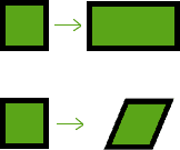
Flat plane shifting is a very powerful tool in the creation of 3D anaglyphs. Less often employed are certain techniques that usually require a computer to do well. Simple stretched and skewed shapes can be made by hand just by plotting horizontal shifts in end points and redrawing straight lines with a straight edge. For complex shapes, however, this could be quite time consuming and even virtually impossible without the aid of a computer.
Incomplete... More to come... eventually