 Stained
Glass Mosaic SignStained
Glass Mosaic Sign
Stained
Glass Mosaic SignStained
Glass Mosaic SignThe Bristow Chamber of Commerce decided to have people decorate Route 66 signs. I'm not sure how much of a fund raiser it might prove to be, but it sounded like an interesting challenge, so I went about it in my own style.
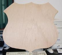
The signs provided by the Chamber of commerce were evidently cut from quarter inch plywood, and looked something like this:
|
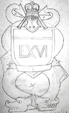
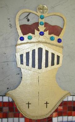
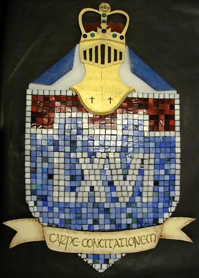
There were no published guidelines, and nothing stipulated that we had to actually use the sign provided, so the first thing I did was brainstorm a design and see where the process took me. I did this piece in October of 2006, and the King Arthur Faire was in the forefront of my mind. The shield shape of the sign sparked ideas of heraldry, and I kept thinking of Merlin's prophecy of red and white dragons. My initial sketch was this basic design. After doing the basic math, I decided that if I made the shield even close to the size of the one provided, that this piece would be too large by comparison to the others with which to burden the show. So I decided to forget the dragons and just focus on the shield, banner, and helm. The roman numerals were simple, and I think they add that archaic feel to this piece. To keep in theme, I decided to go with Latin all the way, and so I went looking for some appropriate translations online. The title of this piece is Rex Viae. That is "King of the Road." Evidently that is also the motto of the 180th Transportation Battalion. The motto that I would use was not as easy. I wanted to translate "get your kicks," but the meaning in English is too idiomatic to translate it literally. I consulted online with a few messages and settled for Carpe Concitationem. It basically means "grasp the excitement." I have George to specifically thank for that translation. |
 |
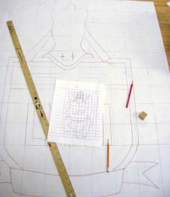 |
At this point I needed a larger drawing to use as a pattern for the design, and so I used a grid. Using a grid is probably the most common enlargement technique in an artist's repertoire. All you need is a measuring tool and something capable of drawing straight lines. I did a few simple calculations and came up with a ratio that would make my shield just a little smaller than the one provided. Since I was going to add some height and width outside the shield shape, I shrank the sign by a few inches. I also decided that since I was using a heraldric theme, I would embattle the line of partition at the top of the shield. The designers of standard U. S. highway signs are more concerned about them being red, white and blue than they are about violating herladric rules of tinctures. Normally red and blue are not placed next to each other on a field. Embattling in this manner made the white line more of a surface feature. In Heraldry, white, known as silver, can be placed next to either red or blue. I suppose with the embattled chief section that this coat of arms represents the first son of Route 66. |
|
For the next part of the process, I needed to gather some supplies: 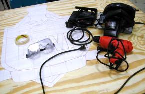 |
I purchased my own piece of quarter inch plywood from the home improvement store and pulled some tools from my garage workbench. 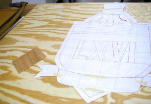 |
|
So that I could better trace both the whole shape and any individual parts, I cut the pattern apart. I traced the banner separately, but I left the back most banner ribbons and the helm attached to the shield shape. I also decided that the mantling would be added later as actual cloth, so I cut it off and just traced around the helm and crown. 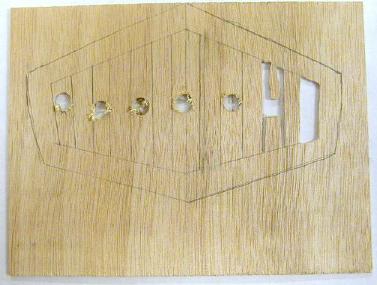 I used a smaller and thinner piece of scrap plywood for the visor. By drilling holes in the board, I was able to insert the blade from my saber saw into the center of the cut out sections. |
 The same saber saw was used to cut all the curves, including the spaces inside the top of the crown. The straight sides were cut with a standard circular skill saw. Here are shown three basic cut out shapes. The base is the shield, the ends of the ribbon, the helm and crown. On top of that are the front of the motto ribbon and the visor. I planned to add everything else to the front and back later. |
|
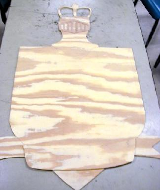
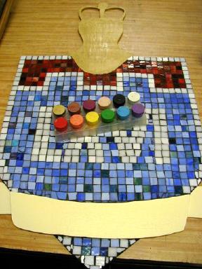
Initially I planned to begin painting on the next step, but I decided that in order to give this piece a more archaic feel that I would use bits of stained glass and make it a mosaic. Since the glass has weight and thickness., this process would also add a little bit of depth to the entire work. Besides, if this were an actual highway sign, the glass would add a reflective surface for easier visibility. This basic design was heavy on the blue tiles, and I had to supplement them with some of my bluer violet and green ones. Since I keep tiles separated in buckets only by basic color, not value, I already had a wide variety of blues to work with. All I did was widen my definition of the hue. If I want to be able to see through glass, I generally use clear siliconized rubber as an adhesive. In this case, liquid nails was cheaper. 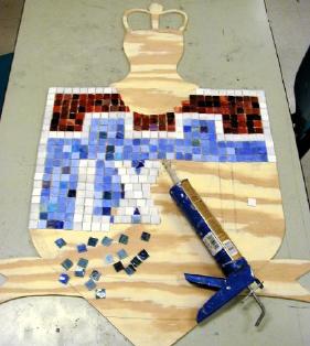 |
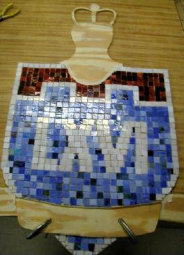 I left the space for the banner ribbon open and glued it in place using liquid nails. Once it was clamped down, I could break some glass shards to glue into the empty spaces around the banner. Incidentally, by using this shield shape instead of the one provided by the Chamber of Commerce, I made it easier to create the square tile pattern. |
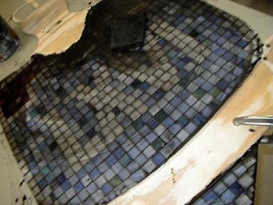
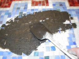 After allowing the glue to dry for a day, I mixed up a bucket of black grout. I chose black to give it a more aged look. I bought some cheap rubber spatulas that work well to spread the grout. Once it is spread, I wiped it down in many stages until the tiles were clean, and the grout filled all the gaps and covered the edge of the wooden sign as well. |
 |
 |
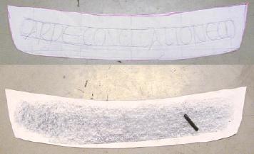
Once the grout had cured for two days, I used a couple coats of good quality sealer to keep moisture out of it. Then I pulled out my acrylic paints. As you can see from my colored top palette tray , I am partial to the cheap craft variety. The gold helmet was the easy part, but I did not have any cream sort of antique white color. Mixing a whole lot of white, and a little yellow and brown did the trick. Then I had to get calligraphy to fit on the banner, so I spaced it in pencil on the pattern and used graphite to copy it onto the painted surface. To add an antique look to the banner, I dry brushed some brown around the edges.
|
 |
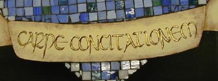 A flat brush and some brown paint provide the customary "thick and thin" lines to my painted uncial hand. A stripe of gold down the center of each letter gives it that extra umph. |
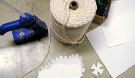 Some mat board, poster board, canvas, glass beads, cotton cord, and paint all contributed to the details. Sometimes all you need are widgets, paint and a hot glue gun. |
 |
|
As an afterthought, I screwed and glued some wood strips and picture hanging wire to the back. If I had been thinking about it in the beginning, I would have screwed it on from the front. 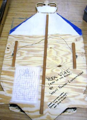 As you can see, I also attached the original sketch and wrote the title on the back. |
 |